PCExpress.ca

Phone screen showing the PC Express website that reads Shop groceries online. Choose pickup near you or delivery on your time.
10 min read
– Role
Product Designer

– Year
2019
– Company
Loblaw Digital

– Responsibilities
UI/UX
Content Strategy
Visual Design

As our online grocery pickup service scaled up to support upwards of 500 pickup locations across multiple store banners, customer acquisition became complex and communicating the core value proposition of the service through the store banners was challenging. With online grocery penetration growing, launching out-of-store pickup locations at transit hubs and condos, alongside the appetite to launch home delivery. The service needed a simpler yet holistic way to acquire new customers.

Examples of mobile designs for the noname website alongside famous noname product packaging for products like peanut butter and tomato sauce
Challenge

Improve acquisition and communication with a dedicated brand.

Loblaw first launched their online grocery offering as an extension of the services provided by the store banners, branded as Click & Collect (modelled off similar naming in European markets like the UK). As the service scaled to more stores nationally, every store banner had an instance of Click & Collect. Requiring unique messaging, materials and app experiences. Competing with other brand and marketing messaging in the stores and with the mindset that the PC Express was merely centred around pickup locations and not its own service, we believed that customers did not fully understand or were even aware of the online grocery service.

PC Express illustrations & icons by Adrian Forrow

Initial Research

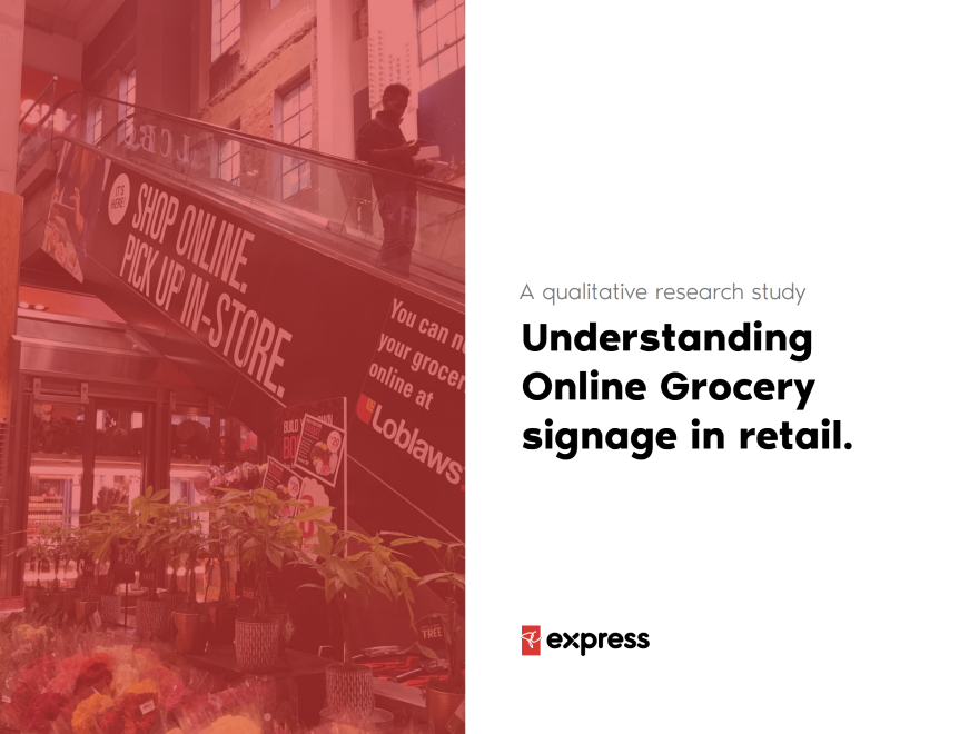
Online Grocery signage in retail

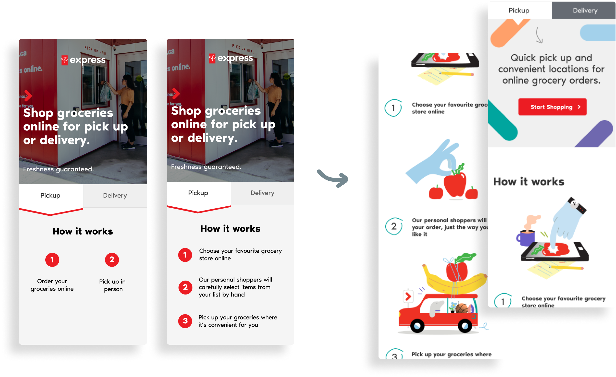
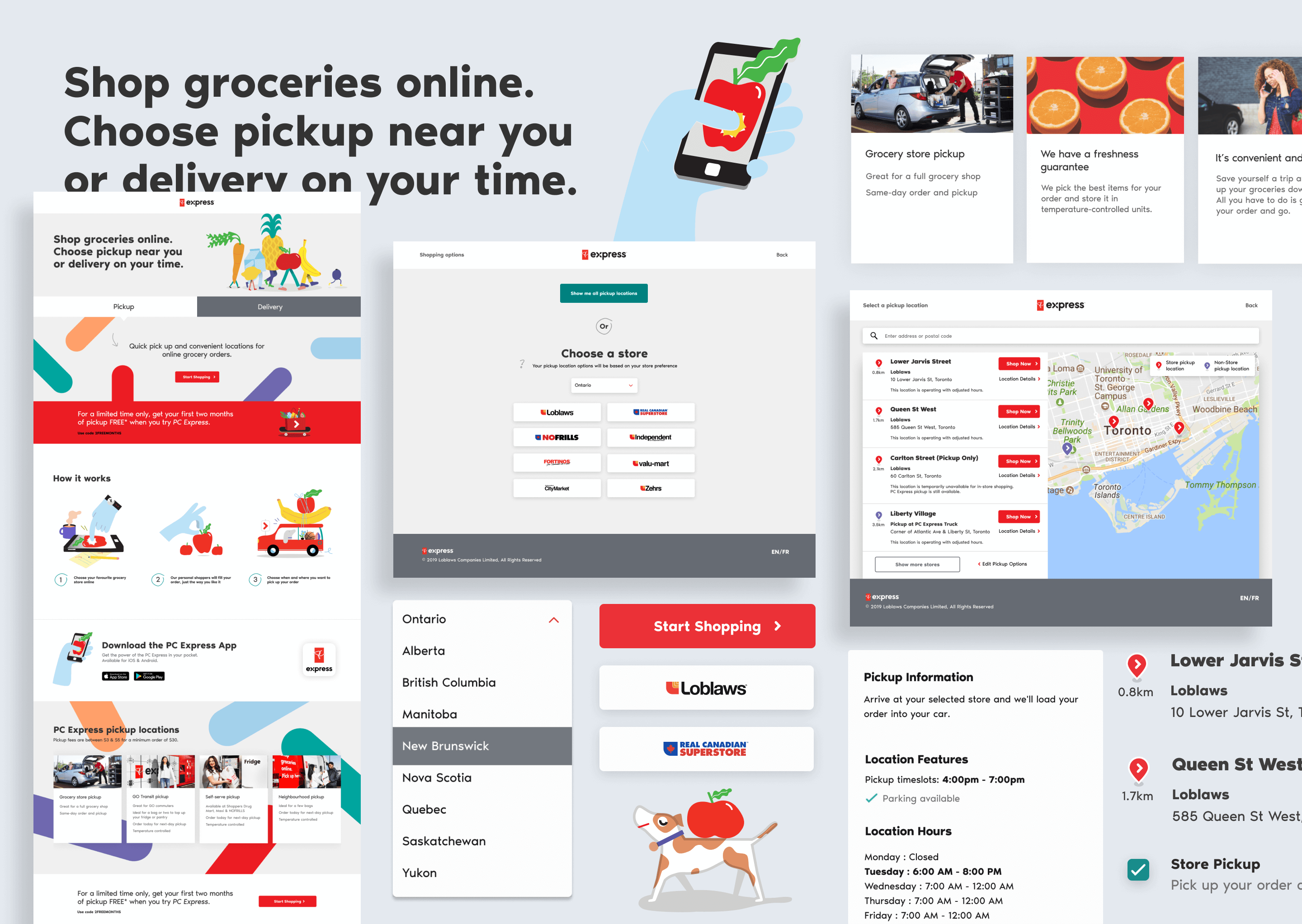
To help us better understand how customers engage with existing messaging, I went into stores to intercept customers and talk to them about the in-store signage for online grocery and learn about their awareness and understanding of the service.

I had some core hypothesis:

  1. Customers didn’t fully understand the service
  2. Customers want to see the added value over going to shop in-store
  3. Customers ignore in-store signage not related to their shopping goals

I visited a range of stores small and large across urban and suburban areas to talk to a breadth of customers with differing needs. The study yielded insights that helped inform the teams as we began developing the new brand experience.

Respondents were not noticing signage
Customers are selectively attentive to signage and are task-focused on finding the items that they need.


“I tend to look at the food more then the walls”
“I know where things are so i’m ignoring signs”
“I only see signage at eye level”

Some respondents are skeptical of online groceries' core value proposition.
Respondents felt that the online grocery experience was no faster than going in-store and wasn’t something they could do on-demand.

“Why is this going to save me time?”
“If i'm coming into the store I might as well do it myself”
“I don't think the browsing experience is faster then in-store”

Current signage is not helping to articulate the process
Respondents were not always sure if the offering was for pickup or delivery. Product freshness and selection was a big concern as well as pickup times and costs

“Will the products be sitting out?”
“I was always nervous they might mess up”
“Tell me where to go to learn more”

The findings were shared with both our internal teams at Loblaw as well as the team at John St that was tasked with brand creative development. It helped lead discussions on messaging and value propositions that we wanted to highlight.

As the brand team got to work on the creative brand development, our product team at Loblaw Digital was tasked with building the digital experience to support the brand launch. In tandem our whole project team began working toward a fixed deadline, maintaining a sprint schedule and a cadence of share outs and rituals that kept the entire team looped in on all work-in-progress.

Flow showing the six step process for adding items to cart
A customer acquistion issue at the time was a convoluted 6 step location and timeslot selection process to add an item cart.

Learn how I helped reduce this process further in my Auto-Localization case study

Design-led discovery

We began thinking about how we could improve the lack of clarity about PC Express. We knew that potential customers looking to shop online, arrived on their favourite banner sites with little content focused on shopping online. Not to mention a convoluted 6 step process of choosing a location before adding a product to cart.

We believed developing a guided start for shopping online with PC Express through a dedicated site, would result in more highly qualified customers heading to banner sites. Using a hypothesis-driven design framework we outlined our design strategy and outcomes. This helped us ask better questions and define the scope. Keeping a tight loop with the working team, we met on a regular cadence over our weekly sprints to layer more fidelity into our flows, tighten our hypothesis and clarify scope and constraints.

We loosely mapped customer journeys and scenarios to quickly tell the story alongside sketches.
Flows and sketches for our design discovery
Our three core hypotheses:
Current issue: lack of clarity about PC Express
 Hypothesis: if we provide a place for simply and clearly stated value props, we should see more new customer ordersCurrent issue: existing flow has high drop-off
 Hypothesis: if we create a guided start to new customers that avoids the existing flow, we should see reduced drop-off during check-outCurrent issue: Finding locations is confusing
 Hypothesis: breaking down the selection process for their location type will reduce drop-off

Prototyping in parallel to brand development

After aligning on hypothesis with the team I developed core flows and wireframes. I first mapped content to address the primary themes from our research, clearly stating the different offerings of pickup and delivery. A three-step overview of how the service works helped provide better education. Alongside this, I decided to break down the different pickup types to help outline where customers could pick up their groceries and clarify the emerging experiences of non-store pickup locations.

Wireframe showing main heading, pickup and delivery tabs and how it works with a short description of how the service works.Wireframe showing available store banners for the shopper to chooseWireframe showing a store locator with a search field, a map and list of stores
Early wireframes & content mapping for our guided onboarding experience

The flows progressed our concept of a guided onboarding experience, taking customers through a three-step process of first asking the customer to choose their favourite banner. This helped filter pickup options to the Loblaw banner they have the highest affinity to. Then asking them to choose a pickup location before handing them off to the banner site to shop.

Mapping content with the wider team gave us a unique opportunity to support brand development by testing our messaging and tone. As part of our usability testing study, we decided to test functional messaging alongside more emotive brand messaging.

Using existing assets and photography we prototyped the experience testing functional vs emotive language.
Flows and sketches for our design discovery
Extending feedback to the brand team gave them qualitative inputs to shape messaging and tone.

We had a few key insights to incorporate into the final iteration alongside the brand expression that was taking shape. Extending the feedback to the brand team gave them a number of qualitative inputs to help shape messaging, tone of voice and comprehension.

Lean into emotive copywriting
Participants gravitated towards emotive copy. The participants felt it had more information about the service and what they should expect.

“This second option for text gives me more trust in the service.”

Include a call to action on initial scroll
I had added the CTA after the narrative so customers had to scroll and engage the content to find the “Get Started” button.

“I typically expect to jump right in and start the order”

Outline price and present offer incentives
Product freshness and selection was a big concern as well as pickup times and costs.

“It would be good to know how much this service costs and I’m always attracted to any type of offer”

Flow showing the six step process for adding items to cart
Testing colour selections for contrast ratios assisted in defining rules around usage.

Layering in the finalized brand identity

The brand identity and platform was developed in parallel with our work on the digital experience. A tight feedback loop between digital to the brand team and the agency gave me the ability to rapidly incorporate visuals and manage content needs directly with the wider team. To meet the tight deadline our technical team was able to start fleshing out a skeleton of the final product even before the brand was given the final approval on a sprint schedule co-ordinated by our design team.

A core principle for PC Express is to help humanize a digitally enabled shopping experience. Accessibility and inclusive design act as a key pillar. To help develop the brand with accessibility in mind, I contributed my expertise to the brand team, assisting them with colour selection, typography and providing feedback and consultation on accessibility during the design process.

7.23%
lift in conversion rates for traffic from pcexpress.ca

Results

Our new PC Express site performed effectively alongside a prominent brand campaign. We successfully validated our hypothesis that better educated and more qualified traffic from PCExpress.ca would convert better on our banner websites. Across a number of our market division banner stores (Loblaws, Fortinos, Provigo and Your Independent Grocer) we saw an average lift of 7.23% in conversion rates for traffic from our PC Express site. A growth in conversion equating to $3 million incremental revenue at the time.

Key learning

Stewarding measurable design

The success of brand launches are often painted subjectively. For the launch of PCExpress.ca we really set out to provide ROI back to the business. I learnt how to better apply qualitative feedback to a cross functional team of creatives as a direct customer voice for use in brand development. Using a hypothesis framework helped not only provide actionable outcomes but also somewhat diminished ambiguity when designing for a new customer engagement channel. Understanding and owning the hypothesis aided collaboration on articulating and measuring core project metrics with the product team. Then when it was time to measure success we could validate our hypothesis, objectives and overall design direction against success metrics the business could quickly understand.

– Team


Next Case study
Noname.ca
All work
View all projects